Designing for Kids: Why kidpop Rejects the “Mini Adult” Mindset
Designing for Kids, Not Just Shrinking for Them
Why thoughtful design starts by seeing children as unique individuals—not miniature adults.
In the world of product design, it’s all too common to see children’s products created by simply scaling down adult models. A smaller handlebar here, a lighter frame there, and suddenly, it’s marketed as “kid-friendly.” But at kidpop, we believe that designing for children requires far more than shrinking dimensions. It demands a deeper understanding of how children move, think, and grow.
Children Aren’t Mini Adults
Children’s physical proportions, motor skills, cognitive development, and emotional responses are fundamentally different from adults. A child’s body is softer, their balance less stable, their hands less coordinated. Their attention span shifts quickly, and their sensory experiences are heightened.
Designing for them means recognizing this difference—not ignoring it.
When we design, we ask:
-
How does this feel in a small, developing hand?
-
Can this encourage curiosity and not just control?
-
Is this intuitive for a 2-year-old, or just convenient for an adult?
These questions guide every decision we make at kidpop.
Common Industry Shortcuts
Too often, children’s products are based on adult-centered logic:
-
Oversized grips made for adult hands, not small fingers
-
Generic saddles that ignore posture support for toddlers
-
Color palettes that scream “children” without understanding child psychology
-
Excessive weight that discourages active use
These shortcuts may reduce production costs, but they also reduce joy, comfort, and safety.
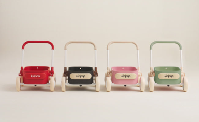
The kidpop Approach: Empathy + Expertise
We design from the child’s eye-level—not the adult’s. Our process starts with the sensory world of kids:
-
Color psychology: We avoid over-saturation and instead use palettes that stimulate and calm in harmony.
-
Ergonomic shaping: From saddle to handlebar, each contour supports growing bodies and helps build motor confidence.
-
Material choices: We balance softness with durability, ensuring that nothing is too hard, too slippery, or too fragile for play.
Take our saddle design as an example. While other brands opt for plush materials or flat boards, we use a saddle-style shape that mirrors a child’s hip curve. It offers just the right balance between support and freedom.
Every Detail Has a Purpose
We don’t do “just because.” Every design choice at kidpop must answer:
“Is this better for the child?”
If the answer is unclear, we go back and refine.
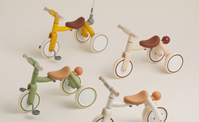
That’s why we created our own seat mold, developed custom color finishes, and refused to follow the crowd with black tires or stiff handlebars. We reengineered the balance bike to make riding feel less like control, and more like an adventure.
Standing in Their Shoes (Literally)
We’ve even gone so far as to simulate how a child sees the world—crouching to their eye level, using their field of view, and analyzing how a toddler reacts to space and movement.
This led to design decisions like:
-
Lower centers of gravity for better balance
-
Wider tire contact for more forgiving terrain
-
Curved handlebar ends to minimize accidental drops
It’s not “extra.” It’s essential.
Conclusion: It’s Not About Making Things Smaller—It’s About Making Them Right
Good design doesn’t just fit a child’s size—it fits their world. At kidpop, we design not for what children lack, but for what they uniquely have: imagination, sensitivity, spontaneity, and wonder.
When we design from that place—with empathy, precision, and joy—we don’t just make smaller bikes.
We make better childhoods.