The Courage to Go White – Why kidpop Chose Beige Tires in a Black Tire World
Design isn’t just about what works. It’s about what speaks.
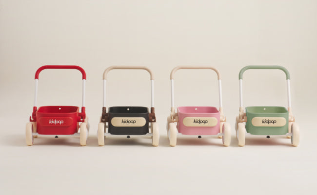
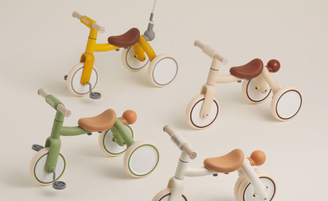
In a world where nearly every children's ride-on comes with black tires, kidpop chose beige.
Not because it was easy.
Not because it was trendy.
But because it was beautiful—and meaningful.
The decision to go off-script with color wasn’t just an aesthetic rebellion. It was a statement about how we believe childhood should feel: pure, soft, a little messy, but always full of light.
The Default Isn’t Always Right
Black tires are everywhere in the ride-on industry for one simple reason: they’re easy.
They’re:
-
Cheaper to mass-produce
-
Easier to clean
-
Less likely to show wear
-
Universally accepted as “standard”
But “standard” wasn’t enough for us.
We asked:
What if the tire didn’t just serve function—what if it added emotion?
What if a child’s ride could feel more like a story, less like a tool?
So we set out to create something the market hadn’t dared to try: a white-toned tire that felt like a cloud under a child’s feet.
The Emotional Power of Beige
To us, color isn’t surface—it’s soul.
Beige isn’t boring. It’s:
-
A warm blanket
-
A soft light
-
A canvas for memory-making
In the context of a ride-on, it evokes:
-
Gentleness rather than aggression
-
Timelessness over trend
-
Elegance that fits in both playrooms and picnic blankets
And most importantly, it invites parents and children to see the bike as part of a home, not just a toy.
Yes, It Gets Dirty (And That’s the Point)
When we first tested our beige tires with families, a common reaction was:
“They’re beautiful—but won’t they get dirty?”
Our answer:
Of course they will.
That’s what makes them real.
Just like a white T-shirt, a pale ceramic cup, or a linen sofa, there’s a kind of poetry in things that can change with time. The scuffs and smudges become part of the journey—proof that your child is living, exploring, riding.
Design isn’t about staying pristine.
It’s about staying meaningful.
The Manufacturing Challenge We Embraced
Choosing beige wasn’t just a visual risk. It was a production nightmare.
Standard tire molds and coloring agents weren’t equipped for the pigments we wanted. We had to:
-
Develop custom molds
-
Test multiple pigment/compound ratios
-
Accept higher material costs
-
Reject inconsistent batches until it was perfect
This process took months, but we never wavered.
Because if we were going to do something different, we had to do it right.
What It Says About kidpop
We didn’t choose beige tires to be “fancy.”
We chose them because they reflect who we are:
-
Attentive to beauty
-
Brave enough to challenge defaults
-
Intentional in every design decision
-
Committed to giving children a world that feels soft, calm, and inviting
Beige tires say:
“This isn’t just a toy. It’s a thoughtful object for a thoughtful childhood.”
Conclusion: Beauty You Can Ride On
In the end, beige tires are more than a visual choice.
They represent a value:
That beauty belongs in movement.
That softness belongs in adventure.
That good design doesn’t just look different—it feels different.
So yes, we chose the color no one else would.
Because at kidpop, we believe in going light—even when the road gets messy.