Why Color Matters: The Emotional Psychology Behind kidpop Palettes
How thoughtful color design inspires emotion, imagination, and early aesthetic sense in children.
When you think of children’s products, you might picture neon pinks, electric blues, and wildly saturated hues that scream for attention. But at kidpop, we believe children deserve more than just loud color. They deserve intentional color—tones that reflect their inner world, nurture their sensitivity, and quietly stir the imagination.
Color, to us, isn’t just visual. It’s emotional. It’s language. It’s how a child first begins to understand and express the world.
Children Perceive Color Differently
From the moment a baby opens their eyes, color plays a crucial role in how they process their environment. Research in color psychology shows that children respond not just to brightness, but to subtle contrasts, warmth, and visual harmony. Unlike adults, who often filter visual stimuli, children experience color with an unfiltered intensity.
That’s why at kidpop, every palette we use is developed with child psychology in mind—not just market trends.
Rethinking the “High Saturation” Myth
Mainstream children’s products rely on over-saturation to capture attention. But too much intensity can be overstimulating, even stressful, for young minds.
Our philosophy is different:
-
We use muted tones to calm and center.
-
We blend pastel hues with thoughtful warmth.
-
We prioritize visual balance over brightness.
-
We celebrate emotional nuance in color.
A bike doesn’t need to shout to be seen. It needs to feel right—safe, soft, inspiring.
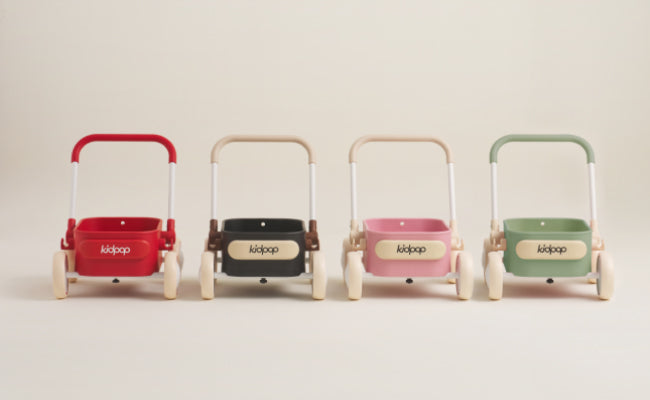
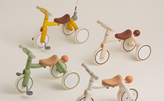
The Emotional Palette of kidpop
Take our “ice white” tone—it’s not just white. It evokes clarity, lightness, and winter’s first snowfall.
Or our morandi greens and mauves—they create a sense of calm curiosity, like wandering through a spring garden.
And our signature beige tire—it invites children to notice texture, contrast, and change as it picks up dust from a trail.
This stands in deliberate contrast to the industry's most iconic choice: the psychology of red in children's toys, which has shaped generations of product design — and which we consciously chose to move beyond.
We see each color as a doorway to emotion.
Color as a Tool for Imagination
Children’s imaginative play is deeply tied to their visual environment. When surrounded by nuanced, story-friendly colors, kids are more likely to:
-
Invent narratives
-
Project emotions onto their toys
-
Build more layered, creative worlds
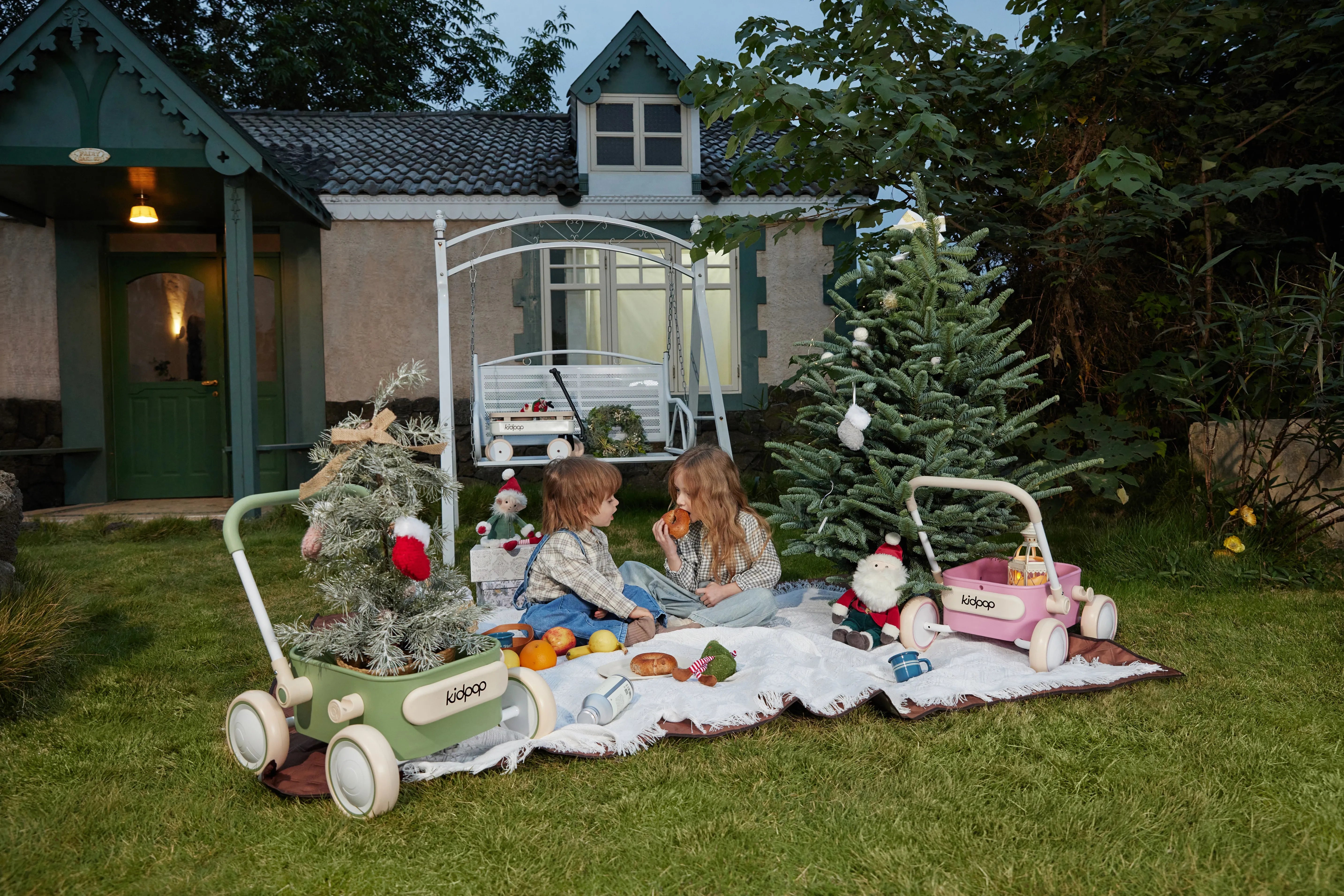
That’s why kidpop bikes often serve as “props” for storytelling. A dusty rose tricycle becomes a fairy chariot. A sage green balance bike turns into a jungle explorer’s ride. We give children a soft color universe—and they bring it to life.
Creating Early Aesthetic Awareness
Designing with refined color isn’t just about visual appeal. It’s about helping children develop their sense of taste and aesthetic judgment from a young age.
We want every child who interacts with a kidpop product to:
-
Feel beauty
-
Recognize subtlety
-
Appreciate harmony
This is how a design object becomes a life-long memory—and how color begins to shape a child’s view of the world.
Conclusion: Color as Care
At kidpop, we don’t use color as decoration. We use it as communication. Every shade is selected with intention, tested with empathy, and placed with purpose.
Because when we design for children, we’re not just giving them something pretty to look at.
We’re giving them a language to feel, to express, and to dream.